Introduction to CSS Grid
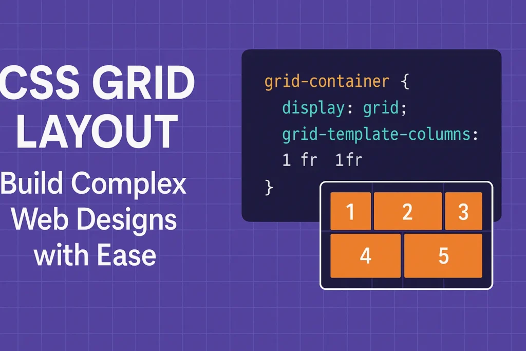
Unlike its predecessors, such as floats and positioning, CSS Grid offers a more intuitive approach to designing grid-based layouts, making it an essential skill for front-end developers. This article serves as a comprehensive guide to understanding and mastering CSS Grid, covering its fundamental concepts, key properties, and practical examples.
Grid Properties
CSS Grid introduces a two-dimensional layout system, allowing developers to define both rows and columns to create intricate designs. Let’s explore some of the essential properties that govern the behavior of CSS Grid:
1. display: grid; : This property converts an HTML element into a grid container, enabling the use of grid layout properties within it.
2. grid-template-rows and grid-template-columns: These properties define the size and number of rows and columns in the grid respectively. You can specify the size using various units like pixels, percentages, or auto.
3. grid-gap or gap: These properties set the gap between grid items, providing spacing and alignment control within the grid layout.
4. grid-template-areas: This property allows you to create named grid areas, simplifying the placement of items within the grid by referencing these named areas in the child elements.
5. justify-items and align-items: These properties align grid items horizontally and vertically within their respective grid cells.
6. justify-content and align-content: These properties align the grid within the grid container horizontally and vertically respectively.
Grid Layout Examples
Now, let’s dive into some practical examples to illustrate how CSS Grid can be used to create various layouts:
Example 1: Simple Grid Layout
CSS
					.grid-container {
    display: grid;
    grid-template-columns: 1fr 1fr 1fr;
    /* Three columns of equal width */
    grid-gap: 20px;
    /* Gap between grid items */
}

.grid-item {
    background-color: #ccc;
    padding: 20px;
}
HTML
					<div class="grid-container">
    <div class="grid-item">Item 1</div>
    <div class="grid-item">Item 2</div>
    <div class="grid-item">Item 3</div>
</div>
This example creates a simple grid layout with three columns of equal width and a gap of 20 pixels between grid items.
Example 2: Responsive Grid Layout
CSS
					.grid-container {
    display: grid;
    grid-template-columns: repeat(auto-fit, minmax(200px, 1fr));
    /* Responsive columns */
    grid-gap: 20px;
}
HTML
					<div class="grid-container">
    <div class="grid-item">Item 1</div>
    <div class="grid-item">Item 2</div>
    <div class="grid-item">Item 3</div>
    < !-- Additional grid items -->
</div>
This example creates a responsive grid layout where the columns adjust automatically based on the available space, with a minimum width of 200 pixels and taking up equal fractions of the available space.
Conclusion
CSS Grid revolutionizes the way we approach layout design in web development, offering a more intuitive and efficient solution compared to traditional methods. By mastering CSS Grid and its key properties, developers can create sophisticated and responsive layouts with ease. As demonstrated through practical examples, CSS Grid empowers developers to build complex grid-based designs that adapt seamlessly to various screen sizes and devices, making it an indispensable tool for modern web development.


