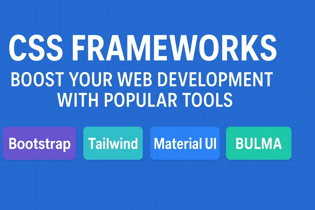
Among the plethora of options available, three prominent frameworks stand out: Bootstrap, Foundation, and Tailwind CSS. Each has its unique features, advantages, and use cases, making the choice between them a crucial decision for developers. In this article, we’ll delve into the characteristics of each framework, compare their strengths and weaknesses, and provide code examples to showcase their functionalities.
Bootstrap: The Industry Standard
Bootstrap, developed by Twitter, has long been considered the gold standard among CSS frameworks. Its extensive documentation, robust grid system, and pre-designed components make it an ideal choice for rapid prototyping and building responsive websites. Bootstrap’s popularity stems from its ease of use and wide adoption across industries.
Key Features of Bootstrap
1. Grid System: Bootstrap’s grid system allows developers to create responsive layouts with ease, utilizing a 12-column grid system that adjusts dynamically based on the screen size.
2. Pre-styled Components: Bootstrap offers a vast array of pre-styled components such as buttons, forms, navigation bars, and cards, saving developers time and effort in designing from scratch.
3. Customizable: While Bootstrap comes with a default theme, it is highly customizable through variables and custom CSS, allowing developers to tailor the design to fit their project’s aesthetic.
					< !DOCTYPE html>
    <html lang="en">

    <head>
        <meta charset="UTF-8">
        <meta name="viewport" content="width=device-width, initial-scale=1.0">
        <title>Bootstrap Example</title>
        <link data-minify="1" href="https://codersship.com/wp-content/cache/min/1/bootstrap/4.5.2/css/bootstrap.min.css?ver=1764967252" rel="stylesheet">
    </head>

    <body>
        <div class="container">
            <h1>Welcome to Bootstrap</h1><button class="btn btn-primary">Click Me</button>
        </div>
    <script>var rocket_lcp_data = {"ajax_url":"https:\/\/codersship.com\/wp-admin\/admin-ajax.php","nonce":"d59ff2b4be","url":"https:\/\/codersship.com\/css\/frameworks","is_mobile":false,"elements":"img, video, picture, p, main, div, li, svg","width_threshold":1600,"height_threshold":700,"debug":null}</script><script data-name="wpr-lcp-beacon" src='https://codersship.com/wp-content/plugins/wp-rocket/assets/js/lcp-beacon.min.js' async></script></body>

    </html>
Foundation: The Flexible Alternative
Developed by ZURB, Foundation prides itself on being a highly customizable and flexible CSS framework suitable for creating modern web experiences. It provides a robust grid system, modular components, and a focus on accessibility and performance. Foundation is an excellent choice for projects requiring more design freedom and flexibility.
Key Features of Foundation
1. Flexbox Grid: Foundation utilizes Flexbox for its grid system, offering greater flexibility and control over layout compared to traditional float-based grids.
2. Modular Components: Foundation’s modular approach allows developers to pick and choose only the components they need, reducing the overall file size and improving performance.
3. Sass Integration: Foundation is built with Sass, allowing for easy customization through variables, mixins, and functions, empowering developers to create unique designs efficiently.
					<!DOCTYPE html>
<html lang="en">

<head>
    <meta charset="UTF-8">
    <meta name="viewport" content="width=device-width, initial-scale=1.0">
    <title>Foundation Example</title>
    <link data-minify="1" href="https://codersship.com/wp-content/cache/min/1/ajax/libs/foundation/6.6.3/css/foundation.min.css?ver=1764988939" rel="stylesheet">
</head>

<body>
    <div class="grid-container">
        <h1>Welcome to Foundation</h1> <button class="button primary">Click Me</button>
    </div>
<script>var rocket_lcp_data = {"ajax_url":"https:\/\/codersship.com\/wp-admin\/admin-ajax.php","nonce":"d59ff2b4be","url":"https:\/\/codersship.com\/css\/frameworks","is_mobile":false,"elements":"img, video, picture, p, main, div, li, svg","width_threshold":1600,"height_threshold":700,"debug":null}</script><script data-name="wpr-lcp-beacon" src='https://codersship.com/wp-content/plugins/wp-rocket/assets/js/lcp-beacon.min.js' async></script></body>

</html>
Tailwind CSS: The Utility-First Approach
Tailwind CSS takes a different approach compared to Bootstrap and Foundation by providing a utility-first methodology. Instead of pre-designed components, Tailwind offers a set of utility classes that can be directly applied to HTML elements, enabling rapid prototyping and highly customizable designs without writing custom CSS.
Key Features of Tailwind CSS
1. Utility Classes: Tailwind CSS comes with a comprehensive set of utility classes that cover styling, layout, and responsiveness, allowing developers to build designs quickly without writing additional CSS.
2. Customization: While Tailwind provides a default configuration, it can be extensively customized through configuration files to tailor the utility classes and design system according to project requirements.
3. Performance: By generating only the CSS classes used in the project, Tailwind ensures a minimal file size and optimal performance, making it suitable for production-ready applications.
					<!DOCTYPE html>
<html lang="en">

<head>
    <meta charset="UTF-8">
    <meta name="viewport" content="width=device-width, initial-scale=1.0">
    <title>Tailwind CSS Example</title>
    <link data-minify="1" href="https://codersship.com/wp-content/cache/min/1/npm/tailwindcss@2.2.19/dist/tailwind.min.css?ver=1764988941" rel="stylesheet">
</head>

<body>
    <div class="container mx-auto">
        <h1 class="text-2xl font-bold">Welcome to Tailwind CSS</h1> <button
            class="bg-blue-500 hover:bg-blue-700 text-white font-bold py-2 px-4 rounded">Click Me</button>
    </div>
<script>var rocket_lcp_data = {"ajax_url":"https:\/\/codersship.com\/wp-admin\/admin-ajax.php","nonce":"d59ff2b4be","url":"https:\/\/codersship.com\/css\/frameworks","is_mobile":false,"elements":"img, video, picture, p, main, div, li, svg","width_threshold":1600,"height_threshold":700,"debug":null}</script><script data-name="wpr-lcp-beacon" src='https://codersship.com/wp-content/plugins/wp-rocket/assets/js/lcp-beacon.min.js' async></script></body>

</html>
Conclusion
Choosing the right CSS framework depends on various factors such as project requirements, design preferences, and developer familiarity. Bootstrap remains a solid choice for projects requiring rapid development and a vast ecosystem of pre-designed components. Foundation appeals to developers seeking flexibility and customization options without sacrificing performance. Tailwind CSS caters to those who prefer a utility-first approach for rapid prototyping and highly customizable designs.
Ultimately, the best framework is the one that aligns with your project goals and development workflow. Experimenting with each framework and evaluating their features firsthand can help you make an informed decision and streamline your web development process.
