Introduction:
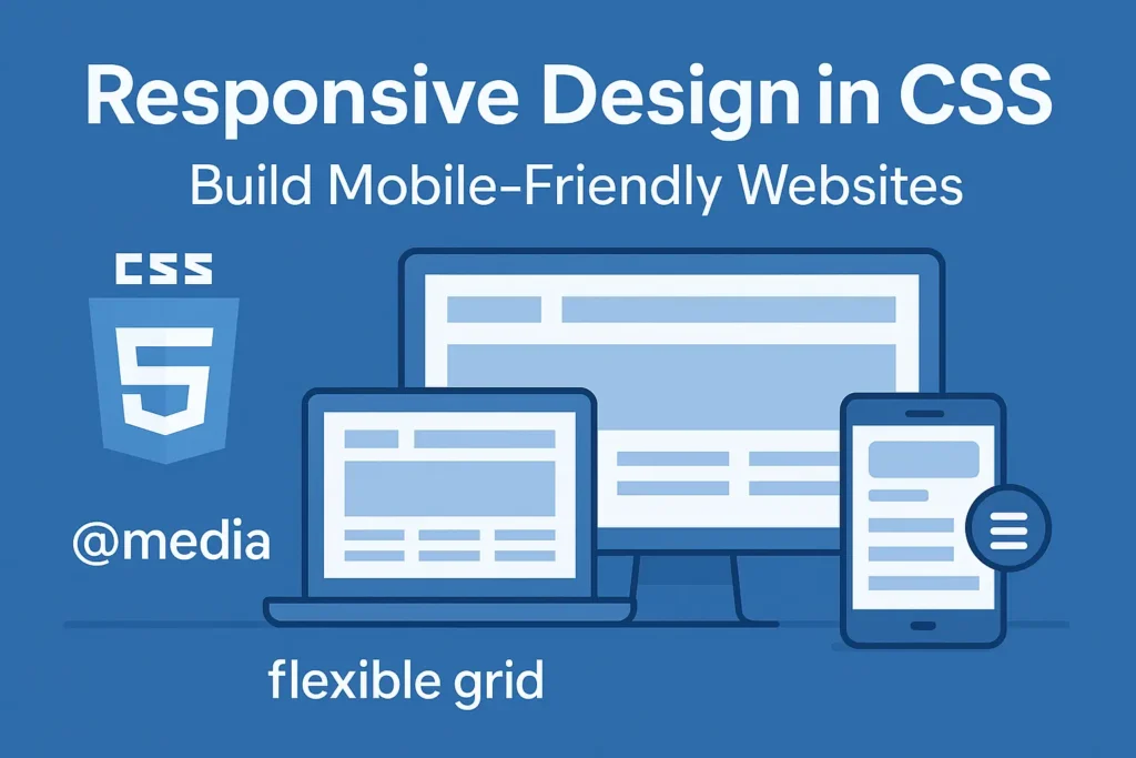
Responsive web design has become indispensable, ensuring that websites adapt seamlessly to different devices. CSS plays a pivotal role in achieving responsiveness, employing techniques like media queries, viewport meta tags, and adhering to mobile-first design principles. In this guide, we’ll delve into these aspects to empower you in crafting responsive and user-friendly web experiences.
Understanding CSS Responsive Design:
Responsive web design aims to create websites that provide an optimal viewing experience across a wide range of devices, from desktops to smartphones. CSS, or Cascading Style Sheets, is the cornerstone for achieving responsiveness by enabling the adaptation of layout, font sizes, and other stylistic elements based on device characteristics.
Media Queries:
Media queries are CSS features that allow developers to apply styles based on various device attributes such as screen width, height, orientation, and resolution. By utilizing media queries, you can tailor the presentation of your website to different viewport sizes, ensuring content remains readable and visually appealing.
Example:
					/* Example of media query for adjusting styles based on screen width */
@media screen and (max-width: 768px) {
    .container {
        width: 90%;
        /* Adjust container width for smaller screens */
    }
}
In this example, the .container class adjusts its width when the screen width is 768 pixels or less, optimizing the layout for smaller devices.
Viewport Meta Tag:
The viewport meta tag is a crucial element in responsive web design, as it enables control over the viewport’s behavior and dimensions on mobile devices. By specifying the viewport meta tag in the HTML document, you can ensure that mobile browsers render the page correctly, preventing issues like zooming and horizontal scrolling.
Example:
					<!-- Viewport meta tag for responsive design -->
<meta name="viewport" content="width=device-width, initial-scale=1.0">
In this example, the viewport meta tag sets the width of the viewport to the device’s width and establishes an initial scale of 1.0, ensuring that the website adapts appropriately to the device’s screen size.
Mobile-First Design Principles:
Mobile-first design is a strategy that prioritizes designing for mobile devices before scaling up to larger screens. By starting with the constraints of mobile devices, designers ensure that essential content and functionality are prioritized, leading to better user experiences across all devices.
Example:
					< !-- Viewport meta tag for responsive design --><meta name="viewport" content="width=device-width, initial-scale=1.0">

/* Example of mobile-first CSS */
/* Base styles applicable to all screen sizes */
body {
    font-size: 16px;
}

/* Media query for larger screens */
@media screen and (min-width: 768px) {
    body {
        font-size: 18px;
        /* Increase font size for larger screens */
    }
}
In this example, the base font size is set to 16 pixels, catering to smaller screens. Then, a media query adjusts the font size to 18 pixels for screens wider than 768 pixels, enhancing readability on larger devices.
Conclusion:
Incorporating CSS responsive design techniques such as media queries, viewport meta tags, and mobile-first design principles is essential for creating websites that offer a seamless and optimized user experience across diverse devices. By mastering these concepts and applying them effectively, developers can ensure that their websites remain relevant and accessible in today’s multi-device landscape.


