Understanding the box model is essential for mastering CSS and creating well-structured and visually appealing web pages. In this article, we will explore the intricacies of the CSS Box Model, covering its components, box sizing, and the role of margin, border, and padding.
Understanding the Box Model
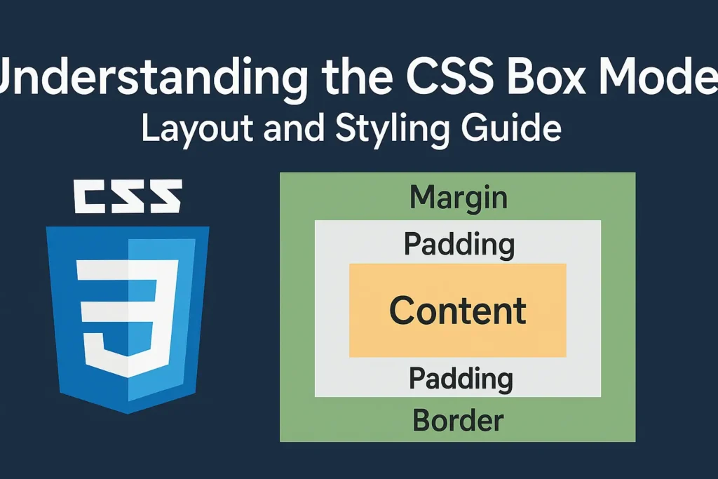
At its core, the CSS Box Model conceptualizes HTML elements as rectangular boxes, each comprising four main components:
Content:
The innermost part of the box, where the actual content, such as text, images, or other HTML elements, resides.
Padding:
A transparent area surrounding the content, providing space between the content and the border. Padding helps control the spacing and layout within the box.
Border:
The border surrounds the padding and content, creating a visible boundary for the box. Borders can have various styles, colors, and widths, allowing for customization of the box’s appearance.
Margin:
The outermost area of the box, representing the space between adjacent boxes. Margins create separation between elements and influence the overall layout of the webpage.
Box Sizing
The default box sizing behavior in CSS determines how the width and height of an element are calculated. By default, an element’s width and height properties only apply to the content area, excluding padding, border, and margin. This behavior is known as the content-box value of the box-sizing property.
However, the box-sizing property allows developers to alter this behavior by specifying different box sizing models. The two main values of the box-sizing property are:
Content-Box:
This is the default value, where the width and height properties only apply to the content area.
Border-Box:
In this model, the width and height properties include the content, padding, and border, but not the margin. This ensures that the specified width and height values encompass the entire box, making it easier to create predictable layouts.
Here’s how you can apply the box-sizing property in CSS:
					/* Apply border-box box sizing to all elements */
* {
    box-sizing: border-box;
}
By applying the border-box value to all elements, you ensure consistency in sizing and avoid unexpected layout issues caused by differences in box models.
Margin, Border, and Padding
Each component of the CSS Box Model—margin, border, and padding—serves a distinct purpose in controlling the layout and appearance of elements.
Margin:
Margins create space around an element, separating it from other elements in the layout. You can specify margin values individually for each side of the element (top, right, bottom, left), or use shorthand notation to set them simultaneously:
					/* Set margin for all sides */
.element {
    margin: 10px;
}

/* Set margin for top and bottom, left and right */
.element {
    margin: 10px 20px;
}

/* Set margin for top, right, bottom, left */
.element {
    margin: 10px 20px 15px 25px;
}
Border:
Borders define the visual boundary of an element, separating its content from its surroundings. You can specify the border’s style, color, and width using the border propert:
					/* Set border for all sides */
.element {
    border: 1px solid #000;
}

/* Set border width, style, and color individually */
.element {
    border-width: 2px;
    border-style: dashed;
    border-color: #f00;
}
Padding:
Padding creates space between an element’s content and its border, ensuring proper spacing and alignment. Similar to margins, you can specify padding values individually for each side or use shorthand notation:
					/* Set padding for all sides */
.element {
    padding: 20px;
}

/* Set padding for top and bottom, left and right */
.element {
    padding: 10px 20px;
}

/* Set padding for top, right, bottom, left */
.element {
    padding: 10px 20px 15px 25px;
}
Putting It All Together
Now that we’ve covered the components of the CSS Box Model—content, padding, border, and margin—and explored the concept of box sizing, let’s see how they work together in a practical example.
					/* Apply border-box box sizing to all elements */
* {
    box-sizing: border-box;
}

/* Style the container */
.container {
    width: 400px;
    margin: 20px auto;
    padding: 20px;
    border: 1px solid #ccc;
}

/* Style the inner element */
.element {
    width: 100%;
    height: 200px;
    background-color: #f0f0f0;
    padding: 20px;
    border: 2px solid #666;
    margin-bottom: 20px;
}
					<div class="container">
    <div class="element">This is an example of the CSS Box Model in action. </div>
</div>
In this example, we have a container element with padding, border, and margin applied to create space around its contents. Inside the container, there’s an inner element with padding, border, and margin specified. By using the border-box box sizing model, we ensure that the specified width and height values include the padding and border, resulting in a consistent layout.
Conclusion
The CSS Box Model is a foundational concept in web development, influencing the layout and design of every element on a webpage. By understanding its components—content, padding, border, and margin—and mastering the concept of box sizing, developers can create responsive and visually appealing web layouts with ease. Experimenting with different combinations of margin, border, and padding, and leveraging the box-sizing property effectively will enable developers to create sophisticated web designs that adapt seamlessly to various screen sizes and devices.


