Introduction
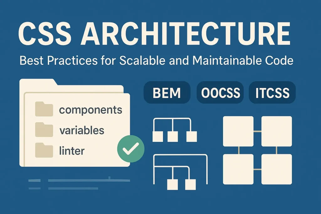
With the growing complexity of modern web applications, having a structured approach to writing CSS becomes essential. In this article, we’ll delve into three popular CSS methodologies: BEM (Block Element Modifier), SMACSS (Scalable and Modular Architecture for CSS), and Atomic CSS. We’ll explore their principles, advantages, and when to use each approach, accompanied by code examples to illustrate their implementation.
BEM Methodology
BEM, which stands for Block Element Modifier, is a naming convention for classes in HTML and CSS. It promotes a modular and reusable approach to styling by dividing components into independent blocks, elements, and modifiers.
In BEM, a block represents a standalone entity, an element is a part of a block, and a modifier alters the appearance or behavior of a block or element. Let’s see an example:
HTML
					<!-- HTML -->
<div class="button">
    <span class="button__text">Click me</span>
</div>ں
CSS
					/* CSS */
.button {
    display: inline-block;
    padding: 10px 20px;
    background-color: #007bff;
    color: #ffffff;
}

.button__text {
    font-weight: bold;
}
In this example, “button” is the block, “button__text” is the element, and we can add modifiers like “button–large” or “button–disabled” to modify the appearance or behavior of the button.
SMACSS
SMACSS, or Scalable and Modular Architecture for CSS, is a style guide that helps organize CSS rules into manageable categories. It emphasizes the separation of concerns and modularization of stylesheets.
SMACSS categorizes CSS rules into five types: Base, Layout, Module, State, and Theme. Base styles define default styles for elements, Layout styles manage the overall layout structure, Module styles encapsulate reusable components, State styles handle dynamic changes in components, and Theme styles define variations for different themes.
Here’s how you might structure your CSS using SMACSS:
					/* Base styles */
body {
    font-family: Arial, sans-serif;
    font-size: 16px;
}

/* Layout styles */
.container {
    width: 80%;
    margin: 0 auto;
}

/* Module styles */
.button {
    display: inline-block;
    padding: 10px 20px;
    background-color: #007bff;
    color: #ffffff;
}

/* State styles */
.button.disabled {
    opacity: 0.5;
}

/* Theme styles */
.button.primary {
    background-color: #007bff;
}

.button.secondary {
    background-color: #6c757d;
}
Atomic CSS
Atomic CSS is a different approach to writing CSS that focuses on creating small, single-purpose utility classes rather than predefined components. It encourages reusability and reduces the need for writing custom CSS rules.
In Atomic CSS, each class represents a single styling property, such as margin, padding, or font size. These classes can then be combined to create complex layouts and designs without writing custom CSS.
					< !-- HTML -->
    <div class="pa2 bg-blue white">Hello,
        World !</div>
In this example, “pa2” represents padding all around, “bg-blue” sets the background color to blue, and “white” sets the text color to white.
Conclusion
Choosing the right CSS architecture depends on the specific needs and complexity of your project. BEM offers a structured approach to naming classes, SMACSS provides guidelines for organizing stylesheets, and Atomic CSS promotes the creation of reusable utility classes. By understanding the principles and advantages of each methodology, you can improve the scalability, readability, and maintainability of your CSS codebase. Experiment with these methodologies and adopt the one that best suits your project requirements.


