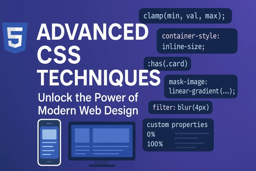
Advanced CSS techniques offer a myriad of possibilities to unleash your creativity and take your designs to the next level. In this article, we’ll delve into three powerful tools: Transforms and 3D effects, CSS filters, and Custom properties (CSS variables). With code examples where necessary, we’ll explore how to harness the full potential of these techniques.
Transforms and 3D Effects
CSS transforms allow you to manipulate the position, size, and rotation of elements in two-dimensional and three-dimensional space. Combined with transitions or animations, they can bring dynamism and depth to your designs. Let’s take a look at some examples:
2D Transforms
					.box {
    transform: rotate(45deg);
}
This rotates the .box element by 45 degrees
					.box {
    transform: translateX(50px) scale(1.2);
}
Here, the .box element is translated horizontally by 50 pixels and scaled to 120%.
3D Transforms
					.box {
    transform: rotateY(45deg);
}
This rotates the .box element around the Y-axis by 45 degrees, creating a 3D effect.
					.box {
    transform: perspective(600px) rotateX(45deg);
}
Adding perspective creates a sense of depth as the .box element rotates around the X-axis.
CSS Filters
CSS filters allow you to apply various visual effects to elements, such as blurring, color manipulation, and more. Let’s explore some common filters:
.element { filter: blur(5px); }
This blurs the .element by 5 pixels, creating a Gaussian blur effect.
					.element {
    filter: grayscale(50%);
}
This desaturates the .element by 50%, turning it into a grayscale image.
					.element {
    filter: contrast(200%);
}
Increasing the contrast of the .element by 200% makes the colors more vibrant.
Custom Properties (CSS Variables)
CSS variables, also known as custom properties, allow you to define reusable values within your CSS. They offer greater flexibility and maintainability compared to hard-coded values. Let’s see how to use them:
					:root {
    --primary-color: #3498db;
}

.element {
    color: var(--primary-color);
}
Here, we define a custom property –primary-color and use it to set the color of .element. If we decide to change the primary color later, we only need to update it in one place.
					.element {
    --size: 50px;
    width: var(--size);
    height: var(--size);
}
By defining –size, we can easily adjust the width and height of .element by changing the value of –size.
Conclusion
Mastering advanced CSS techniques opens up a world of possibilities for creating visually stunning and immersive web experiences. Transforms and 3D effects, CSS filters, and custom properties empower you to design with greater creativity and efficiency. By incorporating these techniques into your projects, you can elevate your web design game and captivate your audience like never before.
Remember, practice is key to mastering these techniques. Experiment, tweak, and refine your designs to discover the full potential of CSS. Happy coding!


