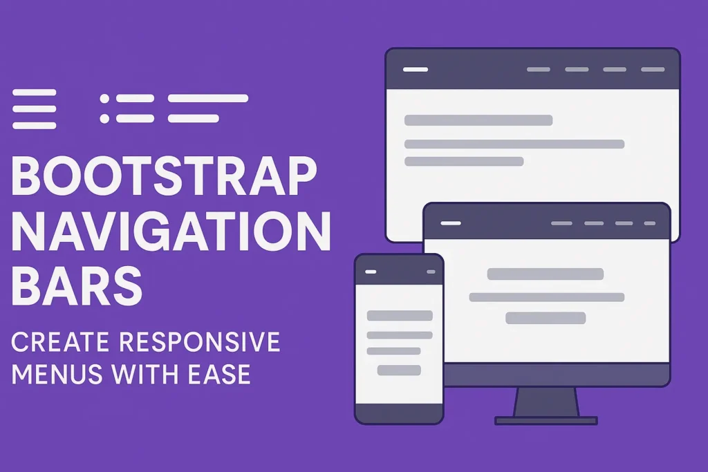
They offer users a means to seamlessly navigate between different sections of a website or application. However, crafting a navigation bar that not only functions flawlessly across devices but also looks aesthetically pleasing can be a daunting task. This is where Bootstrap comes to the rescue with its robust framework for building responsive and customizable navigation bars.
Creating a Responsive Navbar with Bootstrap
Bootstrap, a popular front-end framework, simplifies the process of building responsive web layouts. One of its standout features is the navigation bar component, which adapts effortlessly to various screen sizes, ensuring a seamless user experience across devices.
To create a basic responsive navbar using Bootstrap, you can start with the following HTML structure:
					<nav class="navbar navbar-expand-lg navbar-light bg-light">
  <div class="container">
    <a class="navbar-brand" href="#">Your Brand</a>
    <button class="navbar-toggler" type="button" data-toggle="collapse" data-target="#navbarSupportedContent" aria-controls="navbarSupportedContent" aria-expanded="false" aria-label="Toggle navigation">
      <span class="navbar-toggler-icon"></span>
    </button>

    <div class="collapse navbar-collapse" id="navbarSupportedContent">
      <ul class="navbar-nav ml-auto">
        <li class="nav-item active">
          <a class="nav-link" href="#">Home</a>
        </li>
        <li class="nav-item">
          <a class="nav-link" href="#">About</a>
        </li>
        <li class="nav-item">
          <a class="nav-link" href="#">Services</a>
        </li>
        <li class="nav-item">
          <a class="nav-link" href="#">Contact</a>
        </li>
      </ul>
    </div>
  </div>
</nav>
In the above code snippet, we’ve created a responsive navbar using Bootstrap’s predefined CSS classes. The navbar-expand-lg class ensures that the navbar collapses into a toggleable menu on smaller screens, providing a better user experience on mobile devices. Additionally, the navbar-light and bg-light classes define the navbar’s color scheme.
Navbar Components
A Bootstrap navbar typically consists of several key components:
Brand
The brand/logo of the website or application, usually positioned on the left side of the navbar.
Links
Navigation links that direct users to different pages or sections.
Dropdowns
Multi-level dropdown menus for organizing and categorizing navigation items.
Let’s enhance our navbar by incorporating these components:
					<a class="navbar-brand" href="#">Your Brand</a>
<button class="navbar-toggler" type="button" data-toggle="collapse" data-target="#navbarSupportedContent" aria-controls="navbarSupportedContent" aria-expanded="false" aria-label="Toggle navigation">
  <span class="navbar-toggler-icon"></span>
</button>

<div class="collapse navbar-collapse" id="navbarSupportedContent">
  <ul class="navbar-nav ml-auto">
    <li class="nav-item active">
      <a class="nav-link" href="#">Home</a>
    </li>
    <li class="nav-item">
      <a class="nav-link" href="#">About</a>
    </li>
    <li class="nav-item">
      <a class="nav-link" href="#">Services</a>
    </li>
    <li class="nav-item dropdown">
      <a class="nav-link dropdown-toggle" href="#" id="navbarDropdown" role="button" data-toggle="dropdown" aria-haspopup="true" aria-expanded="false">
        Dropdown
      </a>
      <div class="dropdown-menu" aria-labelledby="navbarDropdown">
        <a class="dropdown-item" href="#">Action</a>
        <a class="dropdown-item" href="#">Another action</a>
        <div class="dropdown-divider"></div>
        <a class="dropdown-item" href="#">Something else here</a>
      </div>
    </li>
    <li class="nav-item">
      <a class="nav-link" href="#">Contact</a>
    </li>
  </ul>
</div>
In this snippet, we’ve added a brand link on the left side of the navbar and included a dropdown menu titled “Dropdown” as one of the navigation items.
Navbar Customization Options
Bootstrap offers extensive customization options to tailor the navbar to your specific design preferences. You can adjust various aspects such as colors, layout, alignment, and behavior using CSS classes and JavaScript plugins.
For example, you can customize the navbar background color by modifying the bg-light class to bg-primary or any other Bootstrap color utility class. Similarly, you can change the text color by applying the appropriate text color classes (text-dark, text-light, etc.).
<nav class="navbar navbar-expand-lg navbar-light bg-primary">
Additionally, you can further customize the navbar by integrating Bootstrap’s JavaScript plugins for interactive elements such as dropdowns, toggles, and tooltips. Make sure to include Bootstrap’s JavaScript file and any required dependencies in your project to utilize these features effectively.
					<!-- jQuery first, then Popper.js, then Bootstrap JS -->
<script data-minify="1" src="https://codersship.com/wp-content/cache/min/1/jquery-3.6.0.min.js?ver=1766086165"></script>
<script src="https://cdnjs.cloudflare.com/ajax/libs/popper.js/2.11.6/umd/popper.min.js"></script>
<script src="https://maxcdn.bootstrapcdn.com/bootstrap/5.3.0/js/bootstrap.min.js"></script>
With these customization options, you can create navigation bars that seamlessly integrate with your website’s design and provide an intuitive browsing experience for your users.
Conclusion
In conclusion, Bootstrap simplifies the process of designing responsive and feature-rich navigation bars for your web projects. By leveraging its predefined components and customization options, you can create navigation bars that not only look great but also enhance user navigation across various devices.
Whether you’re building a simple blog or a complex web application, Bootstrap’s navbar component empowers you to create navigation solutions that meet your specific requirements with ease. So, dive into Bootstrap and elevate your web development journey today!


