In this guide, we’ll delve into the world of Bootstrap modals, exploring their creation, customization, and usage, along with code examples to illustrate each concept.
Introduction to Bootstrap Modals
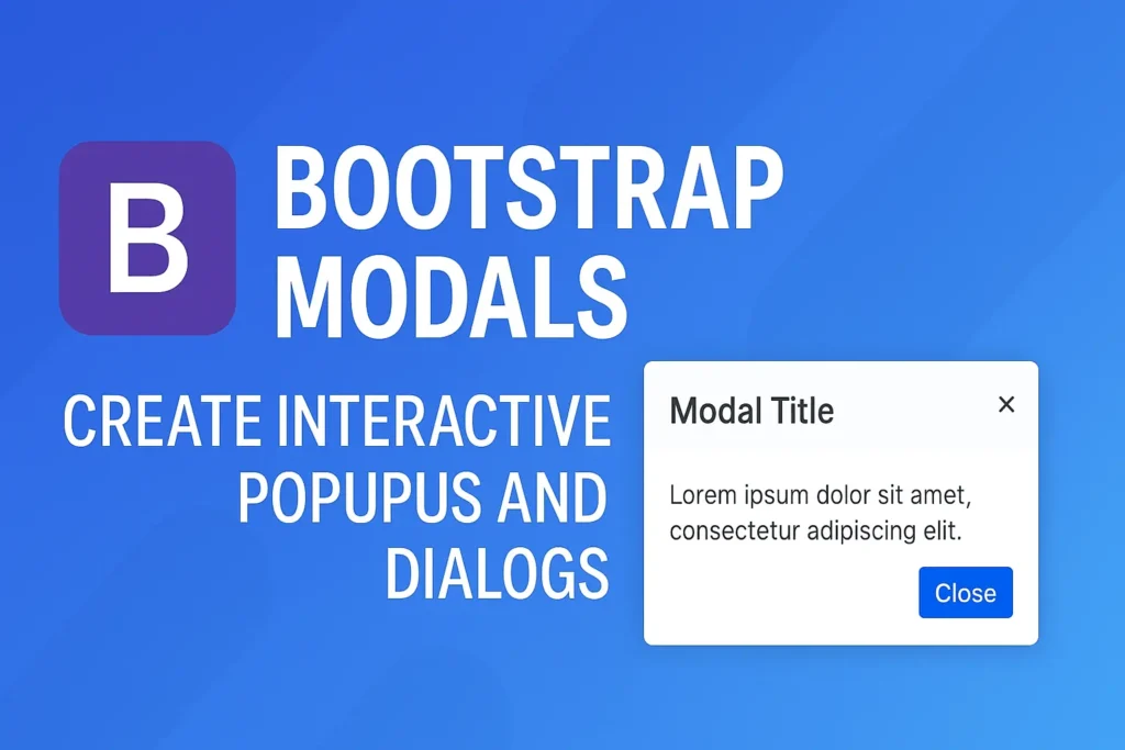
Bootstrap modals are lightweight, flexible, and customizable dialog boxes that are used to display content or prompts to users without navigating away from the current page. They are highly versatile, commonly used for displaying alerts, forms, images, videos, or any other type of content that requires user interaction.
Creating and Triggering Modals in Bootstrap
Creating a modal in Bootstrap is a straightforward process. You start by defining the modal structure within your HTML code and then trigger it using JavaScript or data attributes. Let’s break it down with a simple example:
<!-- Button trigger modal -->
<button type="button" class="btn btn-primary" data-toggle="modal" data-target="#exampleModal">
Launch Modal
</button>
<!-- Modal -->
<div class="modal fade" id="exampleModal" tabindex="-1" role="dialog" aria-labelledby="exampleModalLabel" aria-hidden="true">
<div class="modal-dialog" role="document">
<div class="modal-content">
<div class="modal-header">
<h5 class="modal-title" id="exampleModalLabel">Modal Title</h5>
<button type="button" class="close" data-dismiss="modal" aria-label="Close">
<span aria-hidden="true">×</span>
</button>
</div>
<div class="modal-body">
Your modal content goes here.
</div>
<div class="modal-footer">
<button type="button" class="btn btn-secondary" data-dismiss="modal">Close</button>
<button type="button" class="btn btn-primary">Save changes</button>
</div>
</div>
</div>
</div>
In this example, we have a button that triggers a modal with the ID exampleModal. The modal itself is defined within a <div> with the class modal, containing header, body, and footer sections.
Modal Content and Structure
The content within a Bootstrap modal can vary widely depending on your requirements. You can include text, forms, images, videos, or any other HTML elements within the modal body. Additionally, you can customize the modal header and footer with buttons, titles, or other elements to enhance user interaction.
Here’s an example of a modal with a form:
<!-- Modal with form -->
<div class="modal fade" id="formModal" tabindex="-1" role="dialog" aria-labelledby="formModalLabel" aria-hidden="true">
<div class="modal-dialog" role="document">
<div class="modal-content">
<div class="modal-header">
<h5 class="modal-title" id="formModalLabel">Submit Form</h5>
<button type="button" class="close" data-dismiss="modal" aria-label="Close">
<span aria-hidden="true">×</span>
</button>
</div>
<div class="modal-body">
<form>
<div class="form-group">
<label for="exampleInputEmail1">Email address</label>
<input type="email" class="form-control" id="exampleInputEmail1" aria-describedby="emailHelp" placeholder="Enter email">
</div>
<div class="form-group">
<label for="exampleInputPassword1">Password</label>
<input type="password" class="form-control" id="exampleInputPassword1" placeholder="Password">
</div>
<button type="submit" class="btn btn-primary">Submit</button>
</form>
</div>
</div>
</div>
</div>
Modal Options and Customization
Bootstrap modals offer a plethora of options for customization, allowing you to tailor them to fit your project’s specific needs. Some common customizations include changing the size of the modal, disabling backdrop, adding animation effects, and more.
Let’s explore some customization options with code examples:
Changing Modal Size:
					<div class="modal-dialog modal-lg"> <!-- for large modal -->
<div class="modal-dialog modal-sm"> <!-- for small modal -->
Disabling Backdrop:
					<div class="modal-dialog modal-lg"> <!-- for large modal -->
<div class="modal-dialog modal-sm"> <!-- for small modal -->
Adding Animation Effects:
<div class="modal fade" data-animation="fadeIn">
Conclusion
Bootstrap modals are indispensable components for creating interactive and engaging user interfaces. In this guide, we’ve covered the basics of creating and triggering modals, explored different modal content structures, and discussed various customization options. Armed with this knowledge and the provided code examples, you can harness the full potential of Bootstrap modals to enhance your web projects. Happy coding!
