Responsive design has become a standard practice for web developers, and Bootstrap’s Layout and Grid System provides a powerful toolkit to achieve this goal effectively.
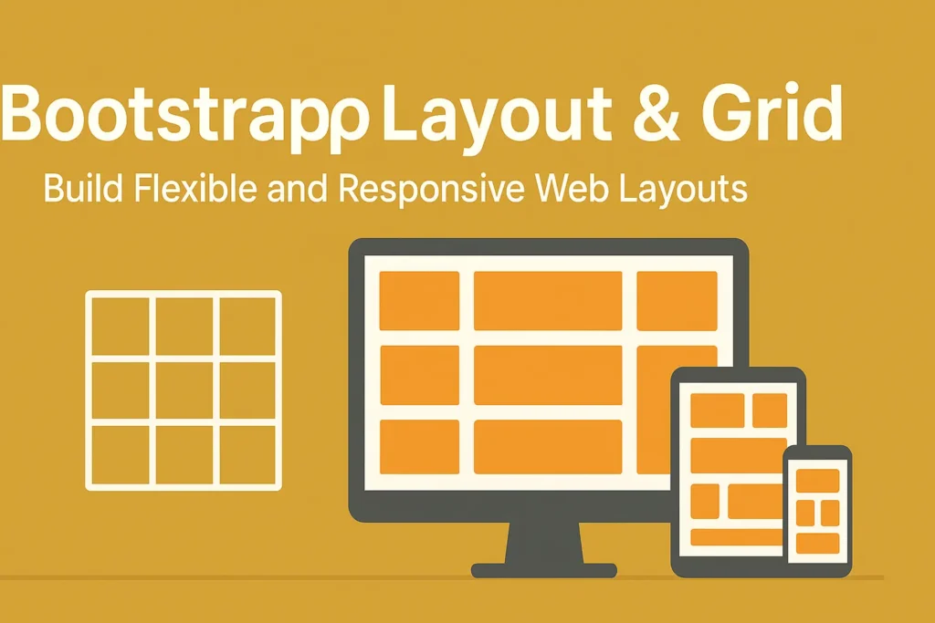
Bootstrap, one of the most popular front-end frameworks, offers a robust set of CSS and JavaScript components for building responsive websites and web applications. At the heart of Bootstrap’s responsive design capabilities lies its Layout and Grid System, which consists of Container, Row, and Column classes. In this article, we’ll delve into how to leverage these components along with responsive design principles and breakpoints to create flexible and adaptive layouts.
Understanding the Basics: Container, Row, and Column Classes
Container:
The Container class serves as the outermost wrapper for your site’s content. It provides consistent padding and ensures proper alignment across different viewport sizes. To create a container, simply use the <div class=”container”> element.
Row:
Rows are used to contain columns within a container. They act as horizontal groups and ensure proper alignment and spacing. You can create a row using the <div class=”row”> element.
Column:
Columns are the building blocks of Bootstrap’s grid system. They allow you to organize content horizontally within a row. Bootstrap utilizes a 12-column grid system, offering flexibility in designing layouts. Columns are created using <div class=”col”> followed by a breakpoint class (e.g., col-md-6 for medium-sized devices).
Responsive Design Principles
Bootstrap’s Layout and Grid System are inherently built for responsiveness. However, it’s crucial to understand the key principles behind responsive design:
Fluid Layouts:
Instead of fixed pixel widths, use percentages or relative units (like em or rem) to ensure that elements resize proportionally based on the viewport size۔
Media Queries:
Media queries allow you to apply CSS styles based on the characteristics of the device, such as screen width, height, or orientation. Bootstrap utilizes predefined breakpoints to simplify the process.
Flexible Images and Media:
Ensure that images and media elements are scalable and adapt to different screen sizes without losing clarity or breaking the layout.
Leveraging Breakpoints for Responsive Layouts
Bootstrap provides five responsive breakpoints, each targeting specific device sizes:
Extra small (xs): Phones (<576px)
Small (sm): Tablets (≥576px)
Medium (md): Desktops (≥768px)
Large (lg): Desktops (≥992px)
Extra large (xl): Desktops (≥1200px)
You can apply breakpoint-specific column classes to control the layout at different viewport sizes. For example:
					<div class="row">
  <div class="col-md-6 col-lg-4">Column 1</div>
  <div class="col-md-6 col-lg-4">Column 2</div>
  <div class="col-md-12 col-lg-4">Column 3</div>
</div>
In this example, on medium-sized devices (md), the columns will occupy half the width (col-md-6), while on large-sized devices (lg), they will occupy one-third of the width (col-lg-4).
Example: Building a Responsive Navbar
Let’s illustrate these concepts with a practical example of creating a responsive navbar using Bootstrap:
					<nav class="navbar navbar-expand-lg navbar-light bg-light">
  <div class="container">
    <a class="navbar-brand" href="#">Brand</a>
    <button class="navbar-toggler" type="button" data-toggle="collapse" data-target="#navbarNav" aria-controls="navbarNav" aria-expanded="false" aria-label="Toggle navigation">
      <span class="navbar-toggler-icon"></span>
    </button>
    <div class="collapse navbar-collapse" id="navbarNav">
      <ul class="navbar-nav ml-auto">
        <li class="nav-item active">
          <a class="nav-link" href="#">Home</a>
        </li>
        <li class="nav-item">
          <a class="nav-link" href="#">About</a>
        </li>
        <li class="nav-item">
          <a class="nav-link" href="#">Services</a>
        </li>
        <li class="nav-item">
          <a class="nav-link" href="#">Contact</a>
        </li>
      </ul>
    </div>
  </div>
</nav>
In this example, the navbar will collapse into a toggleable menu on smaller devices, thanks to Bootstrap’s responsive navbar component.
Conclusion
Bootstrap’s Layout and Grid System, combined with responsive design principles and breakpoints, empower developers to create visually appealing and user-friendly interfaces that adapt seamlessly across various devices and screen sizes. By mastering these concepts and leveraging Bootstrap’s extensive capabilities, you can ensure a consistent and optimal user experience for your web projects, irrespective of the viewing environment.


