In this guide, we’ll delve into the world of Bootstrap dropdowns, exploring their basic implementation, customization options, and advanced usage scenarios.
Basic Dropdown Menus in Bootstrap
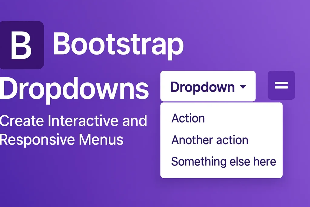
Bootstrap simplifies the creation of dropdown menus with a clean and straightforward syntax. To create a basic dropdown menu, you only need to include the appropriate HTML structure and apply Bootstrap classes.
					<div class="dropdown">
  <button class="btn btn-secondary dropdown-toggle" type="button" id="dropdownMenuButton" data-toggle="dropdown" aria-haspopup="true" aria-expanded="false">
    Dropdown button
  </button>
  <div class="dropdown-menu" aria-labelledby="dropdownMenuButton">
    <a class="dropdown-item" href="#">Action</a>
    <a class="dropdown-item" href="#">Another action</a>
    <a class="dropdown-item" href="#">Something else here</a>
  </div>
</div>
In the above example, the dropdown class is applied to a container element, and dropdown-menu class defines the dropdown menu itself. By adding dropdown-toggle and appropriate attributes, such as data-toggle=”dropdown”, you enable toggling the dropdown menu.
Dropdown Alignment and Positioning
Bootstrap provides options to align and position dropdown menus according to your design requirements. You can control the alignment using classes like dropdown-menu-left, dropdown-menu-right, or dropdown-menu-end.
					<div class="dropdown">
  <button class="btn btn-secondary dropdown-toggle" type="button" id="dropdownMenuButton" data-toggle="dropdown" aria-haspopup="true" aria-expanded="false">
    Dropdown button
  </button>
  <div class="dropdown-menu dropdown-menu-right" aria-labelledby="dropdownMenuButton">
    <!-- Dropdown menu items -->
  </div>
</div>
In this example, dropdown-menu-right ensures the dropdown menu aligns to the right of the button.
Adding Dropdowns to Buttons and Navigation Elements
Dropdowns aren’t limited to standalone buttons; you can integrate them seamlessly into various elements, including buttons and navigation bars.
					<div class="btn-group">
  <button type="button" class="btn btn-primary">Action</button>
  <button type="button" class="btn btn-primary dropdown-toggle dropdown-toggle-split" data-toggle="dropdown" aria-haspopup="true" aria-expanded="false">
    <span class="sr-only">Toggle Dropdown</span>
  </button>
  <div class="dropdown-menu">
    <!-- Dropdown menu items -->
  </div>
</div>
This example showcases a button group with a dropdown attached to one of the buttons. The dropdown-toggle-split class creates a separate toggle button for the dropdown.
Integrating dropdowns into navigation bars follows a similar pattern:
					<nav class="navbar navbar-expand-lg navbar-light bg-light">
  <div class="collapse navbar-collapse" id="navbarNavDropdown">
    <ul class="navbar-nav">
      <li class="nav-item dropdown">
        <a class="nav-link dropdown-toggle" href="#" id="navbarDropdownMenuLink" role="button" data-toggle="dropdown" aria-haspopup="true" aria-expanded="false">
          Dropdown link
        </a>
        <div class="dropdown-menu" aria-labelledby="navbarDropdownMenuLink">
          <!-- Dropdown menu items -->
        </div>
      </li>
    </ul>
  </div>
</nav>
Here, the dropdown is integrated into a navigation bar, providing users with easy access to additional options.
Conclusion
Bootstrap’s dropdowns offer a powerful mechanism for creating interactive and user-friendly web interfaces. With their flexible customization options and straightforward implementation, you can enhance your website’s functionality without compromising on design. Whether you’re building a simple dropdown menu or integrating them into complex navigation structures, Bootstrap provides the tools you need to deliver a seamless user experience.


