Bootstrap, the popular front-end framework, offers a robust set of components to streamline this process, prominently among them being alerts and notifications.
Bootstrap alerts provide a versatile means to communicate messages to users, ranging from simple informational prompts to critical alerts requiring immediate attention. In this article, we’ll delve into leveraging Bootstrap alerts and notifications effectively, covering their usage, customization options, and best practices.
Understanding Bootstrap Alerts
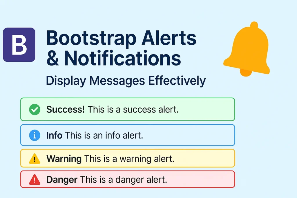
Bootstrap alerts are sleek, unobtrusive components designed to grab the user’s attention without disrupting the flow of the interface. They come in various contextual styles, such as success, info, warning, and danger, allowing developers to convey different levels of urgency or significance.
Using Alert Classes for Notifications
Implementing alerts in your web application is straightforward with Bootstrap. By applying the appropriate CSS classes, you can create notifications that align with your design and messaging requirements.
					<div class="alert alert-success" role="alert">
  Success! Your operation was completed.
</div>

<div class="alert alert-info" role="alert">
  Information: Please review the new updates.
</div>

<div class="alert alert-warning" role="alert">
  Warning: Your session will expire in 5 minutes.
</div>

<div class="alert alert-danger" role="alert">
  Danger! An error occurred. Please try again later.
</div>
These simple markup examples demonstrate how easy it is to integrate different types of alerts into your web pages. Each alert is styled accordingly based on its intended purpose, ensuring clear communication with users.
Dismissable Alerts
Bootstrap alerts can also be made dismissable, allowing users to hide them once they’ve read the message or performed the necessary action. This feature enhances user control and reduces visual clutter on the interface.
					<div class="alert alert-info alert-dismissible fade show" role="alert">
  <strong>Heads up!</strong> This alert can be dismissed.
  <button type="button" class="btn-close" data-bs-dismiss="alert" aria-label="Close"></button>
</div>
By adding the alert-dismissible and fade classes, along with a close button, users can dismiss the alert with ease. This behavior contributes to a smoother user experience, especially in scenarios where multiple alerts might appear sequentially.
Styling and Customizing Alerts
While Bootstrap provides predefined styles for alerts, you can further customize them to align with your application’s visual identity or specific branding guidelines. CSS can be used to modify various aspects of alerts, including colors, typography, and animations.
					/* Customizing alert colors */
.alert-custom {
  color: #fff;
  background-color: #6c757d;
  border-color: #6c757d;
}

/* Customizing alert typography */
.alert-custom h4 {
  font-size: 1.2rem;
}

/* Customizing alert animations */
.alert-custom.fade:not(.show) {
  opacity: 0.8;
  transition: opacity 0.5s ease-in-out;
}
By defining custom CSS rules like the ones above, you can tailor alerts to match your application’s aesthetic preferences or branding requirements. These styles can be applied globally or selectively to specific alerts as needed.
Conclusion
Bootstrap alerts and notifications serve as indispensable tools for enhancing user experience and facilitating effective communication in web applications. By leveraging the flexibility and functionality offered by Bootstrap’s alert components, developers can convey information clearly, prompt users to take action when necessary, and maintain a cohesive design language across their projects.
Whether you’re providing feedback on user interactions, delivering important updates, or alerting users to potential issues, Bootstrap alerts offer a versatile solution that can be easily integrated and customized to meet your specific needs. With their simplicity, flexibility, and visual appeal, Bootstrap alerts remain a valuable asset in the modern web development toolkit.


