A picture is worth a thousand words, and on the web, it’s also worth engagement, clarity, and visual appeal. Adding images is one of the first skills every web developer learns, but mastering it—especially for modern, responsive websites—involves understanding more than just the basic <img> tag.
In this guide, we’ll cover everything you need to know, from the essential image tag to the powerful <picture> element.
✔ The Foundation: How to Use the <img> Tag
✔ Crucial Attributes: src, alt, width, and height
✔ Why the alt Attribute is Non-Negotiable
✔ Introduction to the <picture> Element for Advanced Control
✔ Real-World Use Cases for Responsive and Modern Images
1. The Workhorse: The HTML <img> Tag
The <img> tag is used to embed an image into a web page. It’s an inline and self-closing element, meaning it doesn’t have a closing tag and flows with the content.
Basic Syntax and Key Attributes
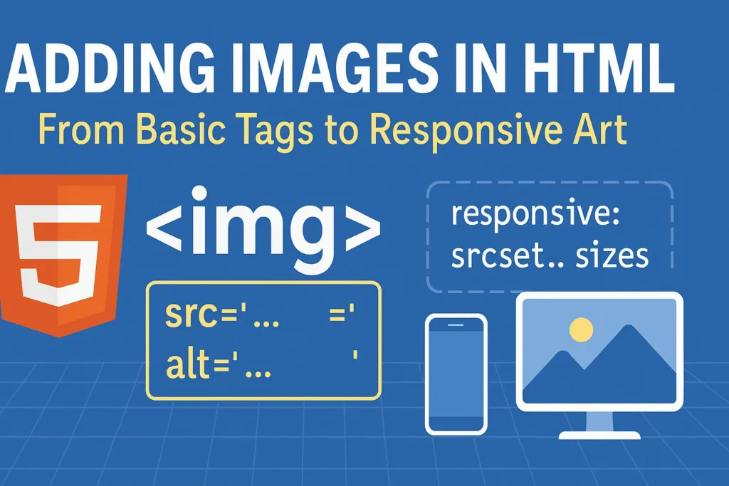
<img decoding="async" src="path/to/image.jpg" alt="Description of the image">
src(Source): This is the most important attribute. It defines the path to the image file. This can be a relative path (images/logo.png) or an absolute URL (https://example.com/logo.png).alt(Alternative Text): This is the second most important attribute. It provides a textual description of the image. It’s crucial for:Accessibility: Screen readers read this text to users with visual impairments.
SEO: Search engines use it to understand the image’s content.
Fallback: If the image fails to load, the
alttext is displayed instead.
widthandheight: These attributes set the intrinsic size of the image in pixels. It’s a best practice to include them to prevent layout shifts as the page loads, which improves user experience and Core Web Vitals.
Example of a well-formed <img> tag:
<img fetchpriority="high" fetchpriority="high" decoding="async" src="images/cat.jpg" alt="A fluffy orange cat sleeping on a windowsill" width="800" height="600">
2. Beyond the Basics: The Modern <picture> Element
The standard <img> tag has a limitation: it can only serve one image file. But what if you want to serve different images to different devices? For example, a large, detailed hero image for desktop users and a smaller, cropped version for mobile users. Forcing a mobile phone to download a massive 2000px wide image is bad for performance and user experience.
This is where the <picture> element comes in.
What is the <picture> Element?
The <picture> element is a container that wraps multiple <source> elements and one fallback <img> element. It lets you declare multiple sources for an image, and the browser will choose the first <source> that matches its current viewport, capabilities, and other conditions.
Syntax of the <picture> Element
					<picture>
  <source srcset="path/to/image-large.jpg" media="(min-width: 1200px)">
  <source srcset="path/to/image-medium.jpg" media="(min-width: 768px)">
  <img decoding="async" src="path/to/image-small.jpg" alt="Descriptive alt text">
</picture>
How it works:
The browser checks each
<source>tag from top to bottom.It looks at the
mediaattribute (which contains a CSS media query, just like in responsive CSS).The first
<source>whosemediacondition istrueis the one whose image (srcset) gets loaded.If no
<source>tags match, or if the browser doesn’t support<picture>, it falls back to the<img>tag inside. The<img>tag is always required.
3. Key Use Cases for the <picture> Element
1. Art Direction (Different Crops for Different Screens)
This is the most common use case. You can serve a wide, landscape image for desktop and a square, tightly cropped image for mobile.
					<picture>
  <!-- Use this image on large screens -->
  <source media="(min-width: 768px)" srcset="hero-desktop.jpg">
  <!-- Use this image on small screens (everything below 768px) -->
  <source media="(max-width: 767px)" srcset="hero-mobile.jpg">
  <!-- Fallback for non-supporting browsers -->
  <img decoding="async" src="hero-desktop.jpg" alt="Artist rendering of the new office building">
</picture>
2. Supporting Modern Image Formats (WebP, AVIF)
Newer image formats like WebP and AVIF offer significantly smaller file sizes at the same quality as JPEG or PNG. However, not all browsers support them. The <picture> element lets you serve modern formats to browsers that can handle them, while providing a fallback for older ones.
					<picture>
  <!-- Try AVIF first -->
  <source srcset="image.avif" type="image/avif">
  <!-- If not, try WebP -->
  <source srcset="image.webp" type="image/webp">
  <!-- Final fallback to a good old JPEG -->
  <img decoding="async" src="image.jpg" alt="A description of the image" width="600" height="400">
</picture>
Here, the type attribute tells the browser the MIME type of the image source.
4. Best Practices for HTML Images
Always Use the
altAttribute: Make it descriptive and meaningful. Leave it empty only if the image is purely decorative (alt="").Optimize Your Images: Before uploading, compress your images. Tools like Squoosh, TinyPNG, or image optimization plugins for your code editor can drastically reduce file size.
Use Responsive Images: For simple resolution switching (serving 1x, 2x, 3x versions of the same image), use the
srcsetandsizesattributes on the<img>tag itself. Use the<picture>element for art direction and format switching.Don’t Forget the Fallback: The
<img>tag inside<picture>is not optional. It ensures your site is robust and works everywhere.
Final Thoughts
Starting with the simple <img> tag is the right way to begin, but truly professional web development involves leveraging the full power of responsive images. The <picture> element is an incredibly powerful tool for developers who care about performance, user experience, and accessibility.
By serving the right image to the right device, you make your websites faster, more efficient, and more delightful to use.